
Understand · what it is and why it exists
01What it is
Market breadth measures how many stocks are taking part in a move. If the S&P 500 rises 1% today, breadth asks a different question: did 400 of its stocks go up, or did 40 very large ones go up while 460 went down?
The index cannot answer that on its own. Most major indexes are weighted by company size, so a handful of giants can move the number while the majority of stocks do something else entirely. Breadth looks underneath the headline number at the crowd.
Think of it as the difference between a team winning because everyone played well and a team winning because one player scored every point. Both are wins. They are not the same kind of win, and they do not tend to last the same way.
02Why it exists
Breadth exists because of how indexes are built. In a capitalization-weighted index, the ten largest companies can carry more weight than the bottom three hundred combined. That design is deliberate — it reflects where the money is — but it means the index can tell you about the giants and stay silent about everyone else.
Traders and investors care about the crowd because durable moves tend to be broad. When many stocks rise together, buying is widespread: pensions, funds, individuals, across industries. When only a few rise, the move depends on a few stories, and a few stories can change quickly.
03How it is measured or observed
There is no single breadth number. Professionals watch several measurements that each answer the participation question a slightly different way:
- Advancing vs declining issuesOn a given day, how many stocks on an exchange closed up versus down. 2,100 up and 700 down is a broad day; 1,400 and 1,400 is a coin flip regardless of what the index did.
- Advance/decline lineEach day's advances minus declines, added to a running total. It turns daily counts into a line you can compare with the index over weeks and months.
- Percent of stocks above a moving averageThe share of index members trading above their 50-day or 200-day average. 80% above the 200-day says most stocks are in uptrends; 30% says most are not, whatever the index shows.
- New highs vs new lowsHow many stocks made a 52-week high today versus a 52-week low. A rising index with expanding new lows is a warning; a falling index with shrinking new lows is the opposite.
- Up volume vs down volumeThe same idea measured in shares traded rather than stocks counted. A 90% up-volume day — where nine of every ten shares traded were in rising stocks — is a one-sided day.
- Equal-weight vs cap-weightCompare an equal-weighted version of an index (every stock counts the same) with the ordinary version. When equal-weight lags, the average stock is lagging the giants.
Read · seeing it in the market
04How professionals read it
Experienced participants do not read breadth as a buy or sell signal. They read it as a description of the market's character, and they read it against price. The question is always the same: does the crowd agree with the index?
When the index rises and breadth rises with it — more advancers, the A/D line making new highs, more stocks above their averages — participation is confirming the move. When the index rises and breadth does not, the move is being carried by fewer and fewer names. That is not a prediction of a fall; it is a statement that the rally is narrowing, and narrow rallies are more fragile.
They also watch extremes. Days when 90% of volume is on one side are rare and informative: a 90% down day after a long rally says selling was indiscriminate; a 90% up day after a long decline says buying was. Two or three of those in a short span are watched as possible turning points.
Finally, they watch breadth over more than one time frame. Daily counts are noisy. The A/D line and the percent-above-200-day are slower and tell you about the trend of participation, not just today's.
05What strength looks like
Strong breadth looks like agreement. The index trends up, the advance/decline line trends up with it and makes its own new highs, and the percent of stocks above their 200-day average sits high and stable. Small caps and equal-weight indexes keep pace with the giants.
On individual days, up-days have advancers outnumbering decliners by two or three to one, and pullbacks are shallow with decliners only modestly ahead. Nothing about it is dramatic — which is the point. Broad markets grind.
Illustrative. The A/D line (gold) confirms each new high in the index (navy) — participation is broad.
Source: illustrative teaching data — not market data
06What weakness looks like
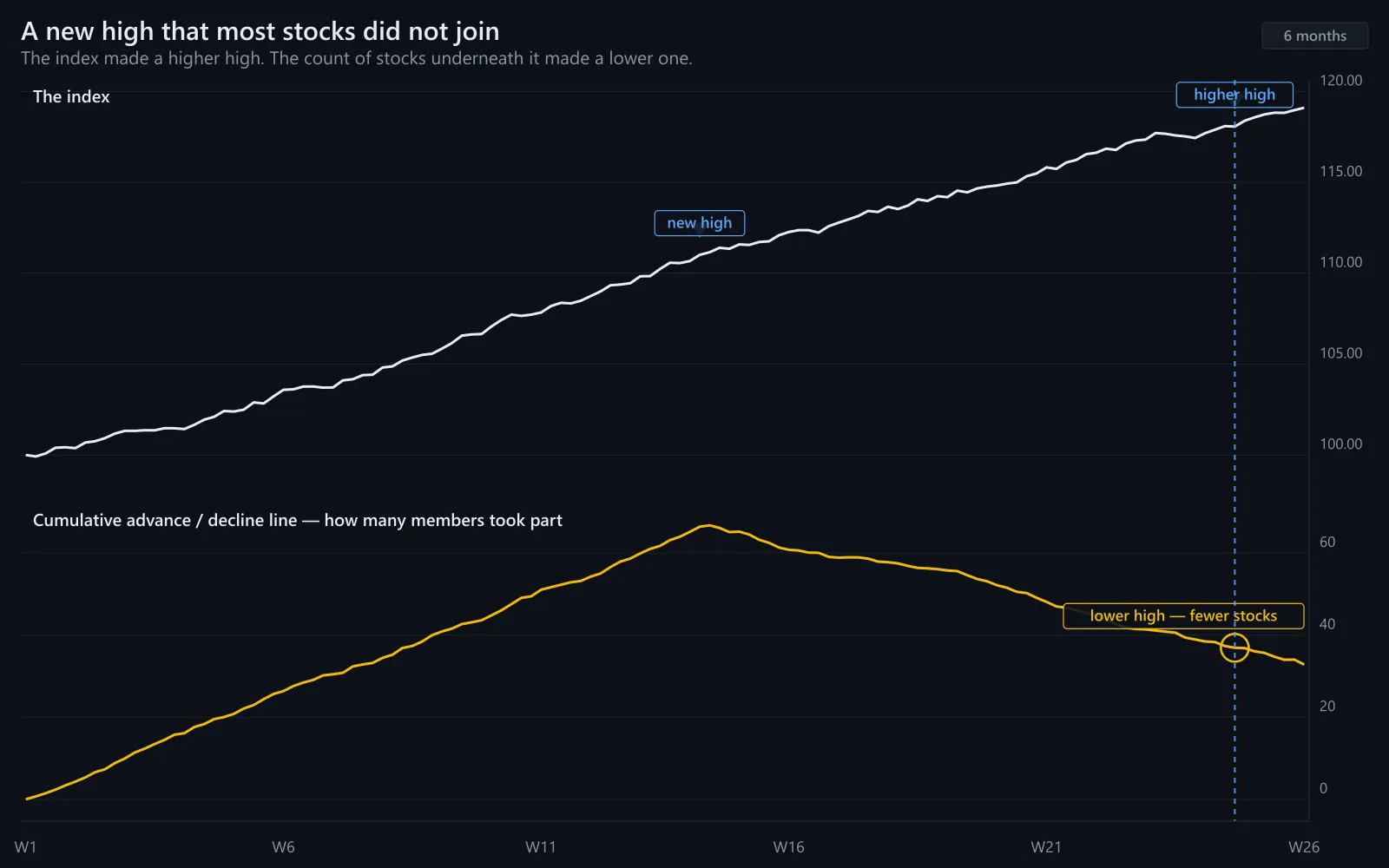
Weak breadth looks like disagreement. The index may still be rising, but the number of advancing stocks shrinks, the A/D line flattens or rolls over, and the percent above the 200-day slips below half while the index holds near highs. Equal-weight lags cap-weight. New lows start appearing even on up days.
It can persist for months — a narrow rally is not an immediate problem. But it means the index's gains rest on fewer shoulders, and when those few stumble there is less underneath to catch the move.
Illustrative. After the midpoint the index (navy) keeps climbing while the A/D line (gold) declines — fewer stocks are participating.
Source: illustrative teaching data — not market data
07What a divergence looks like
A breadth divergence is the specific case where price makes a new high and the breadth measure does not. The index is saying one thing, the crowd is saying another.
Divergences are meaningful but slow. They have preceded many major tops — and they have also persisted for a long time while the index kept rising. The honest reading is: a divergence raises the cost of being wrong, it does not tell you when.
Confirmed high
- A/D line also at a new high
- Percent above 200-day steady or rising
- New highs expanding, new lows scarce
- Equal-weight keeping pace
Divergent high
- A/D line below its prior peak
- Percent above 200-day falling
- New lows creeping up on up-days
- Equal-weight lagging cap-weight
What to look for when the index makes a new high.
Interpret · what it means for you
08What it means for an investor
For a long-term owner, breadth is context, not a timing tool. It tells you whether the market's advance is being shared or concentrated. In a concentrated market, an index fund is quietly becoming a bet on a few companies; it is worth knowing that, even if you change nothing.
It also tempers expectations. Narrow rallies can continue, but the history of very narrow markets is one of eventual catch-down or catch-up — either the giants slow or the rest catch up. Diversified owners tend to prefer the second.
09What it means for a trader
For a trader, breadth sets the environment. On a day when advancers dominate decliners nine to one, fading strength is fighting the whole market. On a mixed day, breakouts tend to struggle because there is no crowd behind them.
Intraday breadth — the running advance/decline count or tick data — is one of the fastest ways to tell a trend day from a range day (see Trend Day vs Range Day). Persistent one-sided breadth from the open is a trend-day signature; breadth that flips back and forth is a range-day signature.
10What it cannot tell you
- It cannot tell you when. A divergence can last weeks or months. Breadth describes quality, not timing.
- It cannot tell you which stocks. Broad participation says the crowd is moving, not which members of the crowd are worth owning.
- It is not a signal on its own. Used alone, breadth measures produce plenty of false alarms; used with price, trend and leadership, they add context those cannot provide.
- Different measures disagree. Advancers versus decliners, the A/D line and percent-above-200-day can point different ways on the same day. When they conflict, the answer is 'mixed', not whichever you prefer.
Apply · the market right now
11What is happening right now
MAAL TRADING ACADEMY market note
No dated note has been published for this topic yet. We only publish current-market commentary written and dated by the academy — nothing auto-generated.
Data · previous close
Live levels for SPY, RSP, IWM appear here once the licensed market-data feed is connected. We do not show unlicensed or made-up numbers.
How to check this yourself today
- Look at today's advancing versus declining issues for the NYSE and Nasdaq (most broker platforms and financial sites publish them under 'market internals').
- Compare an equal-weight S&P 500 ETF with SPY over the last month. If equal-weight is lagging, the average stock is lagging the giants.
- Check the percent of S&P 500 stocks above their 50-day and 200-day averages. Above 70% is broad; below 40% is narrow.
- Look at new 52-week highs versus new lows over the last five sessions, and whether new lows are growing on days the index rose.
12Visual market example
Here is the pattern in its classic form. The index climbs steadily into new highs. For the first half of the period the advance/decline line confirms every high. Then participation thins: the A/D line stops making highs, then turns down, while the index keeps grinding higher on the strength of a few large names.
Nothing in the index chart looks wrong. The warning is only visible underneath it. That is the whole reason breadth exists.
Illustrative. Confirmation in the first half; divergence in the second. The index alone would not show the change.
Source: illustrative teaching data — not market data
Review · practise, keep, connect
13Test your understanding
Read the chart the way you would before a trade. Pick the answer, then read why.
1The index (navy) is making new highs. Is participation strengthening or weakening?
Illustrative.
Source: illustrative teaching data — not market data
2Today the S&P 500 closed up 0.9%. Advancers: 1,450. Decliners: 1,420. What kind of day was it underneath?
Illustrative day.
Source: illustrative teaching data — not market data
14Key takeaways
- The index tells you what the giants did. Breadth tells you what the crowd did.
- Read breadth against price: agreement confirms a move; disagreement means it is narrowing.
- Divergences raise the cost of being wrong; they do not tell you when.
- Use more than one measure and more than one time frame. Daily counts are noisy; the A/D line and percent-above-200-day show the trend of participation.
- Breadth is context for a decision, never the decision itself.
16Learn it in class
Advanced Program · Stage 1 · Finding Stocks in Play
In the Advanced program you read breadth every morning before building the day's watchlist — it helps decide whether the day suits breakouts or patience.