
Understand · what it is and why it exists
01What it is
Sector-versus-market is a sector ETF divided by SPY. It is the relative-strength read at the group level: which of the eleven sectors is leading the index, which is lagging, and where the slope of each ratio is changing. It is the same arithmetic as stock-versus-SPY, applied where leadership is born.
It sits between two other pages: Sector Leadership (which reads the ranking table) and stock relative strength (which reads one name). This is the ratio view that connects them: find the leading sector by its ratio, then find the leading stocks inside it by theirs.
02Why it exists
It exists because stocks move with their sectors more than with the market, and sectors rotate. A stock's relative strength is partly its sector's; a sector's relative strength is partly the market's tone. Reading the sector ratio first tells you how much of a stock's strength is its own.
03How it is measured or observed
Eleven ratios, read together:
- XL?/SPY ratio linesEach sector ETF divided by SPY. The slope is leadership; a change of slope is rotation starting.
- Ratio rankOrder the eleven by ratio slope over one and three months. The top of the list is where stocks in play tend to cluster.
- Stock vs its sectorThe final step: a stock divided by its own sector ETF. Leading the leader is the strongest structure; lagging a laggard the weakest.
Read · seeing it in the market
04How professionals read it
Professionals read sector ratios as the map and stock ratios as the destination. A stock in a sector whose ratio is rising has one tide behind it; a stock that also leads that sector has two. They build watchlists top-down: ratio-leading sectors first, ratio-leading stocks inside them second.
They also watch for the sector ratio to turn before committing to its stocks. A stock leading a sector whose ratio has just rolled over is leading a group that is losing the market's favour — a weaker structure than it looks.
05What strength looks like
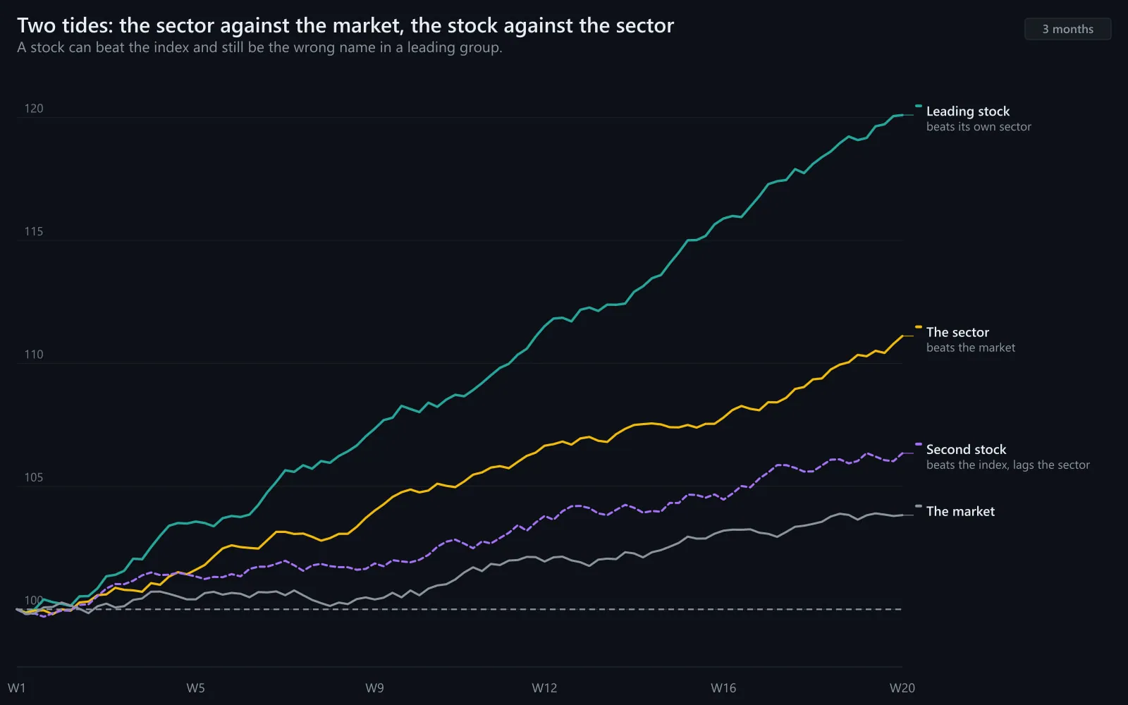
A sector leading the market with the stock leading the sector: two rising ratios stacked. This is the structure the Advanced program studies first, because it tends to have the most participants behind it.
Illustrative. The sector ETF (gold) pulls ahead of SPY (navy) — a rising ratio.
Source: illustrative teaching data — not market data
06What weakness looks like
A sector losing the market: its ratio rolling over after months of leadership, its strongest stocks still making highs on momentum while the group beneath them weakens. The stocks are usually the last to know.
Strong structures
- Stock leads sector, sector leads market
- Stock leads sector, sector in line with market
- Stock in line with a leading sector
Weak structures
- Stock lags a leading sector (left behind)
- Stock leads a lagging sector (swimming upstream)
- Stock lags a lagging sector (weakest)
Strongest to weakest structure.
Interpret · what it means for you
07What it means for an investor
For an investor sector ratios explain why a holding behaves the way it does: most of a bank stock's relative performance is the financial sector's. Understanding that separates 'my stock is weak' from 'banks are out of favour' — different problems with different answers.
08What it means for a trader
For a trader this is the watchlist method: sector ratio first, stock ratio second, catalyst third. It is how the Advanced program narrows the market to a handful of names before the open.
09What it cannot tell you
- Sector ratios can be driven by two giants; check internal breadth.
- A rising sector ratio can mean the sector fell less in a sell-off, not that it rose.
- Rotation can reverse quickly; confirm over weeks.
Apply · the market right now
10What is happening right now
MAAL TRADING ACADEMY market note
No dated note has been published for this topic yet. We only publish current-market commentary written and dated by the academy — nothing auto-generated.
Data · previous close
Live levels for XLK, XLF, XLE, XLI, SPY appear here once the licensed market-data feed is connected. We do not show unlicensed or made-up numbers.
How to check this yourself today
- Chart the eleven sector ETFs each divided by SPY over three months.
- Rank them by slope.
- For the top sector, chart its three largest stocks each divided by the sector ETF.
11Visual market example
The bridge in one picture: a sector ratio rises, and inside it the leading stock rises faster still. Two ratios, stacked. A trader who found the sector first found the stock second, with the group moving the same way.
Illustrative. Sector (gold) leads SPY (navy); the stock (blue) leads the sector.
Source: illustrative teaching data — not market data
Review · practise, keep, connect
12Test your understanding
Read the chart the way you would before a trade. Pick the answer, then read why.
1Financials' ratio to SPY has risen for six weeks. A bank stock is up 8% in that time; XLF is up 12%. How is the stock doing?
Illustrative.
Source: illustrative teaching data — not market data
13Key takeaways
- Sector ÷ SPY is relative strength one level up; eleven lines map the leadership.
- Watchlists are built top-down: leading sectors, then leading stocks inside them.
- Stack the ratios: stock leads sector leads market is the strongest structure.
- A sector ratio that rolls over weakens the case for its stocks.
15Learn it in class
Advanced Program · Stage 1 · Finding Stocks in Play
Advanced Day 1's watchlist is built in exactly this order: sector ratios, then stock ratios inside the leaders, then catalysts.